 INKFISH is an established design studio with a solid reputation for creating visually compelling websites, email newsletters, brochures, logos and business stationery. With experience in beauty, arts, architecture, NGO, property, education, tourism and food & beverage industries there is hardly anything we haven’t touched in the last 15 years.
So if you’re looking for a highly skilled design agency, with a proven track record, INKFISH offers value for money to clients who would like to take their branding and marketing to the next level or who are tired of spending a fortune with the big agencies. You’ll enjoy our no-nag policy that ensures 24-hour response time to all requests.
We understand design. We understand the web. We understand what you need.
And we understand the importance of delivering on time and to budget.
Inkfish Design Studio have been an incredible help. I have been working closely with Neil McCreadie’s team on full designs for the WordCamp Cape Town event. They have committed to help me with all design aspects for the event, which is a massive contribution.
WordCamp organiser, Ashley Shaw
When we started organising WordCamp I published a blog post on this site about the first draft ideas for this year’s WordCamp Cape Town event. We had a flurry of comments, suggestions and ideas. This input helped us choose a direction for the final logos. Neil McCreadie took charge and after numerous rounds of tweaks his team delivered a perfect final product. I am very grateful for their contribution to WordCamp! Take a look at all the WordCamp branding this year below and read the interview with INKFISH.
Logo Designs
We have two different layouts of the logo.
Supporter Badges
Shortly after finalising the logos, Inkfish moved on to designing some great supporter badges. I would like to appeal to campers to add the applicable badge(s) to your website or blog. You can grab the respective HTML code snippets from our blog post about the badges.
Website Designs
Next we moved on to applying the branding to the website. We only have CSS editing capabilities which makes it challenging to create what we want, but we are very happy with the results nonetheless.
Social Media Branding
This is the first time we have gone all out and branded every aspect of a social media campaign, I could not have done it without the help from Inkfish.
Support us by liking, following and RSVP’ing on the social networks.
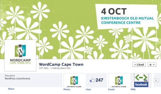
Facebook Fan Page
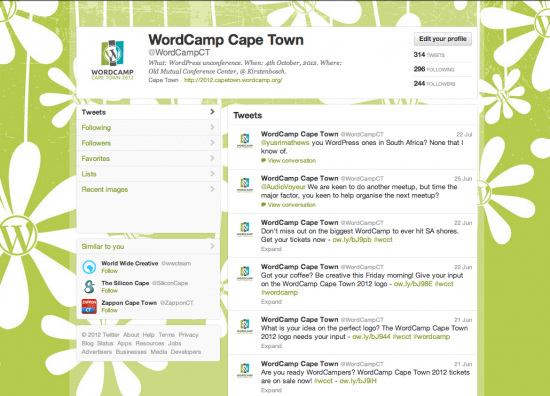
Twitter Profile
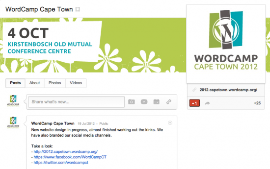
Google+ Fan Page
Add the Google fan page to your circles.
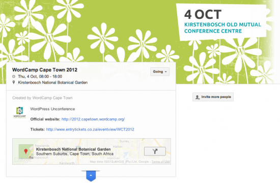
Google+ Event Page
Social Icons
![]()
![]()
![]()
![]()
And now, the interview with INKFISH
Why WordPress?
It’s clean and intuitive admin interface is easy for our clients to manage, it’s quick to deploy, easy to modify and with the introduction of custom post types, has become an incredibly practical CMS that can provide solutions for many of our clients without the need for complicated and expensive coding.
Why did you decide to get involved and sponsor WordCamp Cape Town 2012?
It was after attending last year’s WordCamp that I decided to make the switch from ‘that other CMS’ to WordPress as the CMS of choice for our studio. When I heard that Ashley was doing it again this year, I felt like it was our chance to give something back.
What are your thoughts on the WordPress community as a whole? And the South African WP community?
I feel that it is a solid community with a lot of talented and good people driving it. The SA community seems to be pretty big and growing by the day from what I can gather. We’ll see on Thursday…
What are you most looking forward to at WordCamp Cape Town?
The flowers ;o) I’m quite looking forward to Fred’s talk, but in general to hear what everyone has to say and just soak up all the little snippets of information throughout the day, while hanging out with a bunch of cool people, including my own team from Inkfish.
Please share one WP tip
It’s easier to update than Joomla.
Tell us more about how you became interested in WordPress, what about it drives your continued interest?
What really got me interested in WordPress was WooCommerce, which was released around the time of the last WordCamp. I really like how the community drives it’s progress, and where things are heading. The more we work with it, the more surprised I am at what we can achieve. Until then, shopping carts were just generally a nightmare to put together for clients.
Do you make money from wordpress?
Yes.
Is WordPress an effective platform for getting your message across?
Yes, although to be honest we are only just about to switch to WordPress for our own website. Will let you know how it goes…
Where do you feel you can make a difference at WordCamp and why?
I woud like to think that by providing the design of the logo and other branding for the event that we have played a supportive role in making the event a success before the day. On the day I plan to simply be an attendee and enjoy the result of all the hard work that you guys have put in to making it happen.
Inkfish has been an integral part this year’s event, providing all design and giving creative direction. How do you aim to benefit from the event?
I believe that we will benefit from the exposure received leading up to the event and from networking on the day. Our design service can be of benefit to all companies/agencies/individuals attending WordCamp. We understand how to design for the modern web and really enjoy engaging on projects with new challenges, requiring design solutions to enhance functionality as well as communication.





















I think it all looks great, love the design, it is subtle yet striking and remains with you…
Only suggestions I have is that, regarding Google+ Page and Events Page:
– It would be nice to see the Logo on the Events Page, as the date and place is set already on the top of the feed in the description, would it not be possible to switch out the Date in the header image for the Logo?
I would not think that Logo and Date & Place graphic would be necessary in the header as it would mess with the clean look and feel of the header image…
– With regards to the G+ Page, is it not possible to reduce the size of the Date & Place graphic to bring out the flower pattern more, also create a bit more space between Logo and Date graphic
Inkfish, nice job on the branding and nice follow throught from Lightspeed. Very directional and it’s making me look forward to spring.
4th October here we come!