We’ve had a lot of feedback on the first drafts of the sticker and t-shirt designs. We’re taking it as a vote of confidence that some of you have shown the willingness to stick the WordCamp Cape Town stickers on your MacBooks, and we’re powering forward.
The idea behind this draft of the designs was to present an alternative, simplified approach to the WordCamp 2012 branding, making use of regular WordPress logos with variations of the colour scheme.
Before commenting, please note that the light grey outlines around each sticker represent the dye-cut guidelines (just in case anyone mistakes it for a tacky design choice).
There are:
- 1. Circular Sticker
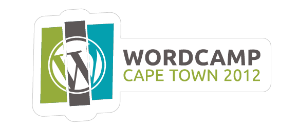
- 2. Shapely Sticker – Long
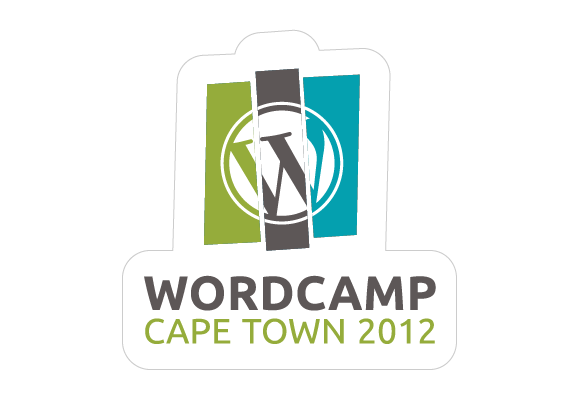
- 3. Other Shapely Stickers
- 4. Code Stickers
- 5. Name Tags
Let us know what you think!
1. Circular Stickers
Small, simple WordPress logos in the individual colours of the WordCamp 2012 colour scheme. The larger example adds two white bars for extra texture, should all have this feature?
2. Shapely Sticker – Long
3. Another Shapely Sticker
4. Code Stickers
Small identification stickers featuring shortcode brackets and Twitter-style hash tags.

5. Name Tags
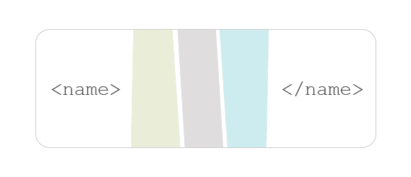
Here are four options for the name tags, with various placements of the logo and the HTML tags.

We appreciate all the great feedback we’ve received so far, please keep it coming!















I think your new code sticker ideas are cool.
ah – yes. that’s looking better… 🙂
Thanks for all the feedback Neil, I hope you like the final designs!