Thank you for all the great feedback we received on the first draft designs. We carefully considered your ideas and threw a few new elements into the mix. Were excited to show them and hear more from you.
 So guys and gals, as you did the last time, carefully scrutinise these and tell us what you think.
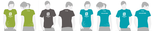
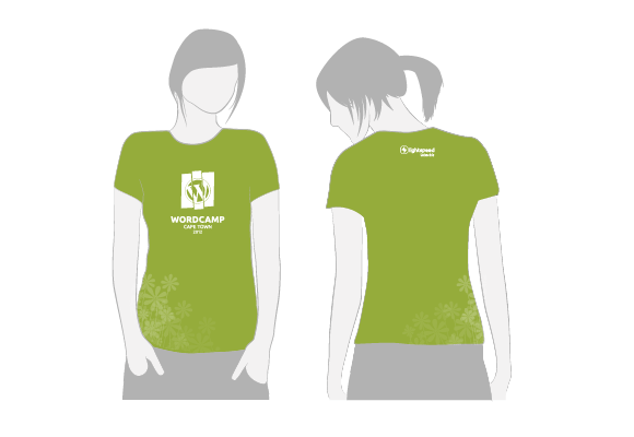
Female Attendees
Featuring:
- A pale green colour, instead of a dark blue
- The logo moves up the front of the shirt
- A light and elegant floral pattern adorns the bottom right side
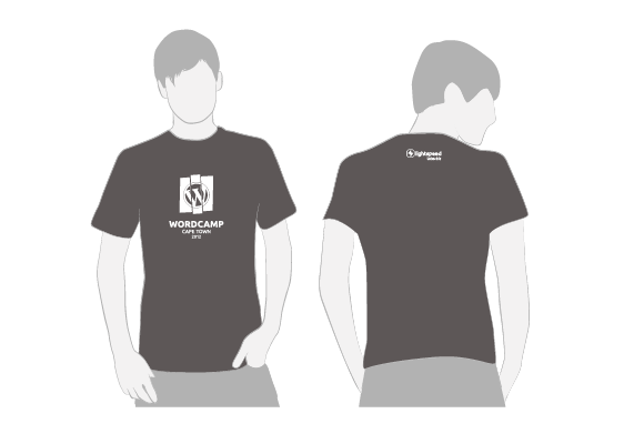
Male Attendees
Featuring:
- A dark grey colour, not a dark green, as requested by you
- The front logo in white and we added some text
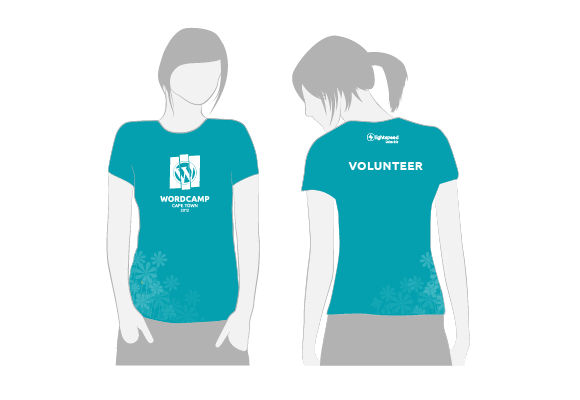
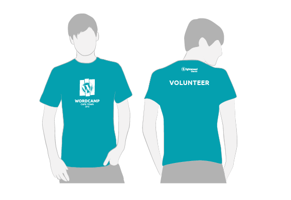
Male and Female Volunteer t-shirts
Both have the same design elements represented in the attendee t-shirts, but both are in turqoise.
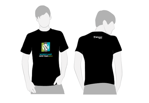
Speaker t-shirts
featuring:
- Black background, the logo and text on the front has colour.
That’s it, but were not done. Now the floor is yours to tell us what you think and make the t-shirts your own. Please take a few minutes to:
- Consider the lists that describe each t-shirt
- Do you like the design direction, have a few tweaks?
- Do you have brand new ideas?
- Take all your thoughts and ideas and add them to the comments below.
It’s your last chance, before these already fantastic t-shirts go off to print!


personally – I prefer the shirt to be free of any company branding. I understand that you can leverage off the exposure, but it seriously reduces the chance of the shirt being worn… 🙂
Not sure I like that part of the logo disappears into the background. From a brand perspective it’s inconsistent and I feel that it weakens the original logo.
Probably biased here, but I prefer the original options, and reckon shirt colour alone is enough to differentiate between speaker/sponsor/mc/attendee with no additional text needed – will save you a bunch on the printing too.
Floral detail is a nice touch though.
Remember the BArcamp tshrts bak in 2007. The sponsor logo was tiny. I wore it until the tshirt was broken. my wordcamp CT tshirt from last year: never wore it because it had SPEAKER huge on it. Drop the size of the sponsor logo and remove SPEAKER. The colour differentiation does more than enough and WP users are smarter than the rest.
Thank you Neil and Rafiq for your comments. We have taken them into account and updated this post with new designs.
Only the speaker t-shirt now has colour print and we removed SPEAKER, white print only on the rest to keep costs down. At the same time the branding for the event is kept more consistent.
We also dampened the focus on our company branding significantly. Much smaller now, only right that the event branding enjoys the most real estate.
Thanks again guys.
We did leave a label for VOLUNTEER as we want people to be identified as volunteers by attendees on the day, this will aid people in identifying who to ask for assistance.