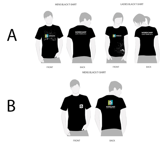
No WordCamp would be complete without a dedicated T-shirt to run around in on the day. Inkfish Design Studio has come up with the following designs for the official WordCamp Cape Town 2012 T-shirts.
Keeping the print white-only will reduce cost significantly, and a pure white logo will work with a variety of coloured T-shirts.
The organizing team, MC and speakers will have a different base colour, preferably black, to distinguish them from the attendees.
We want your input!
The Inkfish guys have a few other ideas, but want to hear from you first before knocking out the next batch.
What say you WordCampers? Are you looking forward to strutting your stuff at WordCamp in these T’s?
- Which colours would you prefer?
- Are there other design elements that should be included?
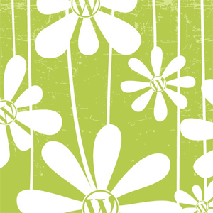
- Would you prefer a floral print like the one used for the event?
Shout out your thoughts and ideas in the comment section below.
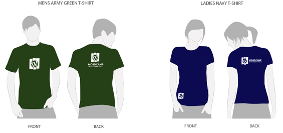






















Really like the minimal design and colours. The logo on ladies front – bottom right is a great idea, different to the norm.
I really like the attendees men’s design. It feels balanced with a nice sized print on the front and a more informative print on the back.
Perhaps keep the design to just that, with different colours for speakers, etc?
Folks at the event could, thus, be identified as speakers by the colour of their shirt, as well as their name tag (I don’t reckon the t-shirt needs to specifically say “Speaker” or anything like that).
In terms of printing, the men’s attendees design would also be cost effective, as it’s a single colour in what is, essentially, two square shaped prints. If the t-shirts are being screen-printed, this would make the process far smoother (as the design would be the same for all the different t-shirts, as well as being the same colour ink/powder used).
On the whole, I feel the logo should be the main focus for the t-shirt design. It’s a really nice, bold event logo, so let it shine! 🙂
I will work on some colour ideas for the different roles like attendee, volunteer, media & speaker. The colours will need to complement the logo, some careful planning needed. We are proud of the new logo, so I very much agree with you that the logo should be the main focus 😉
Last year we added a label to identify the volunteers, media & speakers (VIPs)…. I don’t feel attendees need a label, but it was helpful when the VIPs wore their respective tshirts last year.
I don’t mind spending a little bit more on tshirt printing if we yield something that people will want to wear.
Thanks for your input Matty!
I love the design layout and placement of the Logo’s. The Color for ladies also looks very good. Think the colors should be closer to the actual logo colors but for everything else, well done
Not so sure about the green. Love the logo and agree with Matty on the color coding!
Love the design, not sure about the colour either.
I like the idea of having different colours for the different roles at WordCamp. The current one colour (white) logo is cool, I wouldn’t change it.
And for my money anyone should be staying as far from floral print as possible.
I quite like the team shirt but if we have to go for one colour for the attendees then ok. No floral print for me please 🙂
Very nice designs, esp the name badge.
How about you do red t-shirts for the speakers/organisers and green/black/navy for the attendees. Would be nice to have a URL on the back or even front of the t-shirt as well. 🙂 Name badge.. hmm. It’s ok. Maybe a simple “meetup” style? Pls pls dont make the stickers so big like last time. No space on my macbook http://goo.gl/gZDXJ
The only thing I’d suggest is to keep logos/imagery to the fronts and wording on the backs, this is common for band/musician tour shirts and I feel that a similar vibe can equate to WordCamp.
I suggest, keep the colours to the event colours. Dark grey, light green and light blue. So maybe light green T’s for men, light blue for ladies. Both with the dark grey writing. Or, both T’s dark grey and alternate the colours on a white backdrop like the sticker.
The black T-shirts are awesome! lets go with those! Please not the flowers no guy will wear that besides to wear as painting clothes and to go to rocking the daisy’s…