My LightSpeed team often collaborates with the Inkfish Design team on projects. We are very grateful that Inkfish have offered their design services for the WordCamp Cape Town 2012 event.
Work In Progress
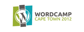
The first step is for us to decide on a direction for the new WordCamp CT logo. We have some initial logo designs that we would like to get community feedback on. I encourage WordCampers to offer your thoughts and comments on these, and if you have any favourites or suggested changes then drop a comment.
It’s important to keep in mind that these logos are still work-in-progress and not ‘final’, we’re just starting to explore some ideas.
Of course colours are flexible, so feel free to suggest mixing and matching between options. For some of the logos we’ve incorporated last year’s colours to show what it would look like if we retain the colour scheme for consistency between events.
The options with the ‘W’ logo in Cape Town are still rough and need more work, but we can explore these further if you like the idea.
In some cases we still need to add the support copy, like the year 2012, to be incorporated. This could change the way the designs sits, but all of these factors will be explored further once direction is decided.
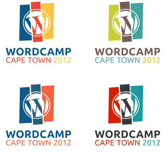
Logo option using the W in WordPress really effectively
Versatile logo option with similar colours to 2011
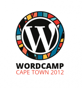
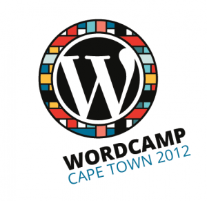
Logo option with some lovely African colours
Hope everyone likes the ideas!
Thanks
Ashley
Update – Wednesday 20 June 2012 @ 12pm
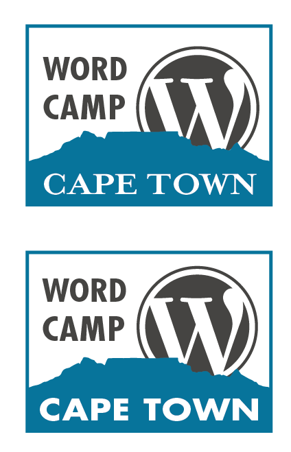
Feedback related to Byron’s comment about Table Mountain.
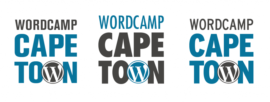















Awesome, I love them all really. I am a big fan of type logos, but if I was to offer any crit on the first batch, it would be to stroke the “W” so that the logo appears inset into the rest of the type, rather than just stuck on top.
That said, if I look at the all at a glance, the last batch stand out the best.
Maybe some incorporation of (yes, it’s cliché) Table Mountain?
We had some ideas with Table Mountain, but held back due to the cliché factor… Ash has updated with a very rough version of this concept… We even looked at distorting the W to mimic the mountain shape, but this was a bit of stretch (pardon the pun). Personally I’d like to explore the first option further and work on integrating the logo into the type – have a feeling it’s going to come down to font selection and some fine typography tweaks.
Yeah, the cliché factor was something I worried about a little, but if incorporated nicely with text, it could have some legs.
This is a little play on word and image that I came up with now, obviously not 100% the way I would go as the mountain is not completely visible, but nice use of font etc.
I like option 2 – the versatile logo [one on the left]. It can adapt to any other platform easy. It will also go well with last year’s mascot.
Thanks for your input. Definitely keen to re-use the mascot you guys created.
also like the versatility of this one. will work well across both print and online application.
I also like option 2. Its quite dynamic. As an idea… you could let the 3 color bands form table mountain on top.
The Logo variation with the vibrant Arican colours is my favourite, definitely. Clean, simple, themed, nuff said! Great work.
I’m not a fan of the Table mountain one, a logo needs to be able to work in B&W and I feel it’s too rigid in that border, I like versatile logo option 1 or 2 but I would incorporate the African feel or stronger colours into that one, take away the pastel colours. Really looking forward to Word Camp, I heard about it last year but couldn’t make it. Got my tickets, amped!
A first timer who already has her tickets? You’re teaching the rest of the pack something. We’re looking forward to having you there Shannon!
I like the versatile logo options, as well as the first option with the African colours (the variation without the tilted text).
Looking forward to WordCamp Cape Town 2012! 🙂
Byron’s proposed option is also great!
Thanks for the input Matty!
Hi Team,
I like the first african colours option, really rocks!
Also, can you please make smaller version, last one took over my whole cover of
my Macbook and had to take it off 🙂 Not much room left
Versatile logo set, the second one of the two 🙂
For me it’s either the second ‘versatile’ one or the first African colours one. They look super smooth without looking like they’re trying too hard.
I dig the ubuntu flavours. The first one is rad.
I’m a big fan of the “Logo option using the W in WordPress really effectively” set and of those, the second option would be my choice.
I’d like to point out that ALL the logo’s are awesome and if I had to pick a second choice, it would be the left logo with the African feel to it.
Definitely the Versatile option for me 🙂 I also like Byron’s proposed design in the comments. The african colours come a close third!
Versatile logo option 1 or 2 look great! prefer option 1 though. Nice options!